
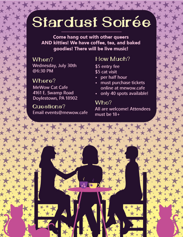
Left: First queer meetup flyer for at the cat cafe. I wanted to showcase a small group of individuals mingling with cats and coffee. A star pattern design is also implemented in the background. While having nice contrast both in value and also color, the flyer was later found to be busy.
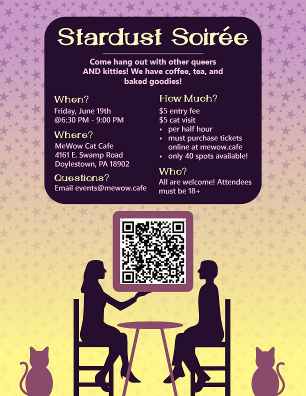
Middle: Current format for queer meetup flyers at the cat cafe. I created a transparency gradient to simplify the background so that it still had the stars as the client requested, but didn't take away from the piece by making it too busy. The drinks on the table, figure in the middle, and third cat were also removed for simplicity and to make space for the QR code so that it could be scanned in person. Colors were also darkened to provide greater contrast.
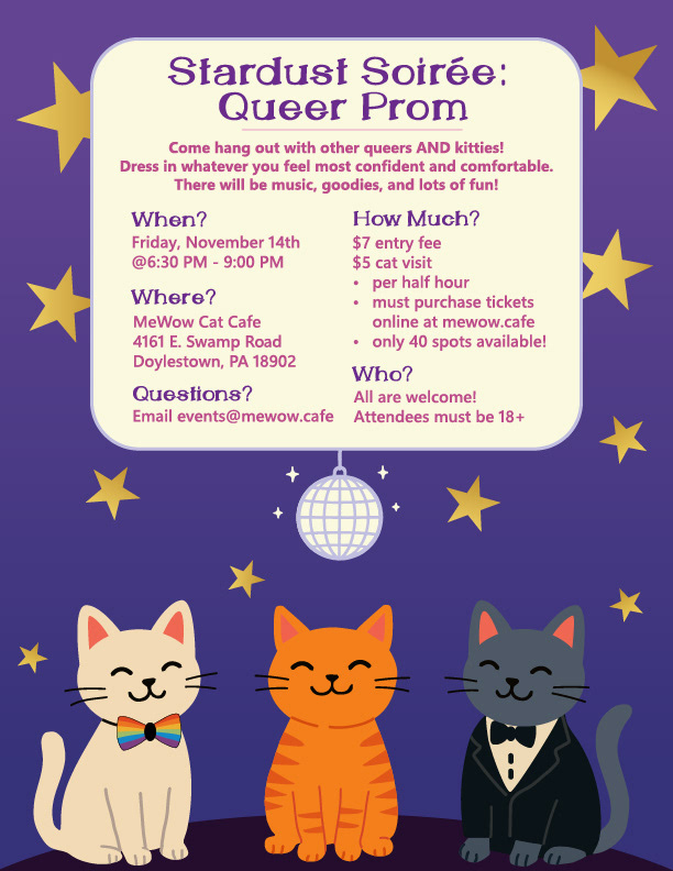
Right: Flyer for a queer prom event at the cat cafe. Client provided source material and it was recreated with vector shapes. This design was aimed to be more simplistic yet effective to help showcase the cats at the bottom.